
The "Philly Nights" and "The District" designs are derived from the 1969-1971 San Francisco Warriors basketball throwback logo (nicknamed "The City") (one of my favorite logos of all time). And I thought it would be cool to put a Philly and DC spin on the concept. So if Philadelphia and DC had a logo like that one, this is what I think it would look like. Notice the word "Philly" spelled out in the stars, and I chose the nighttime because I think center city has one of the best skylines lit up at night. The maroon/baby blue colorway is derived from the baseball jerseys that the Phils rocked in the 80's.


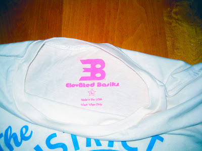
I went with a different colorway for "The District" mainly because I needed to incorporate the DC flag into the design in some way. The three red stars and two red lines represent the DC flag and skyline goes left to right: Lincoln, Capitol, Jefferson, Monument, and White House. Just for a little flare, the inside tag is in highlighter pink as a reference to the type of urban 80's style of clothes found in shops around M and Wisconsin, which generally incorporates brighter colors.

For "The District" design, there's a women's specific shirt which has more of a v-neck type of neckline, size Small only.

So be sure to pick one up (or both!) from the online shop which will be up shortly...thanks for the support!!!


No comments:
Post a Comment